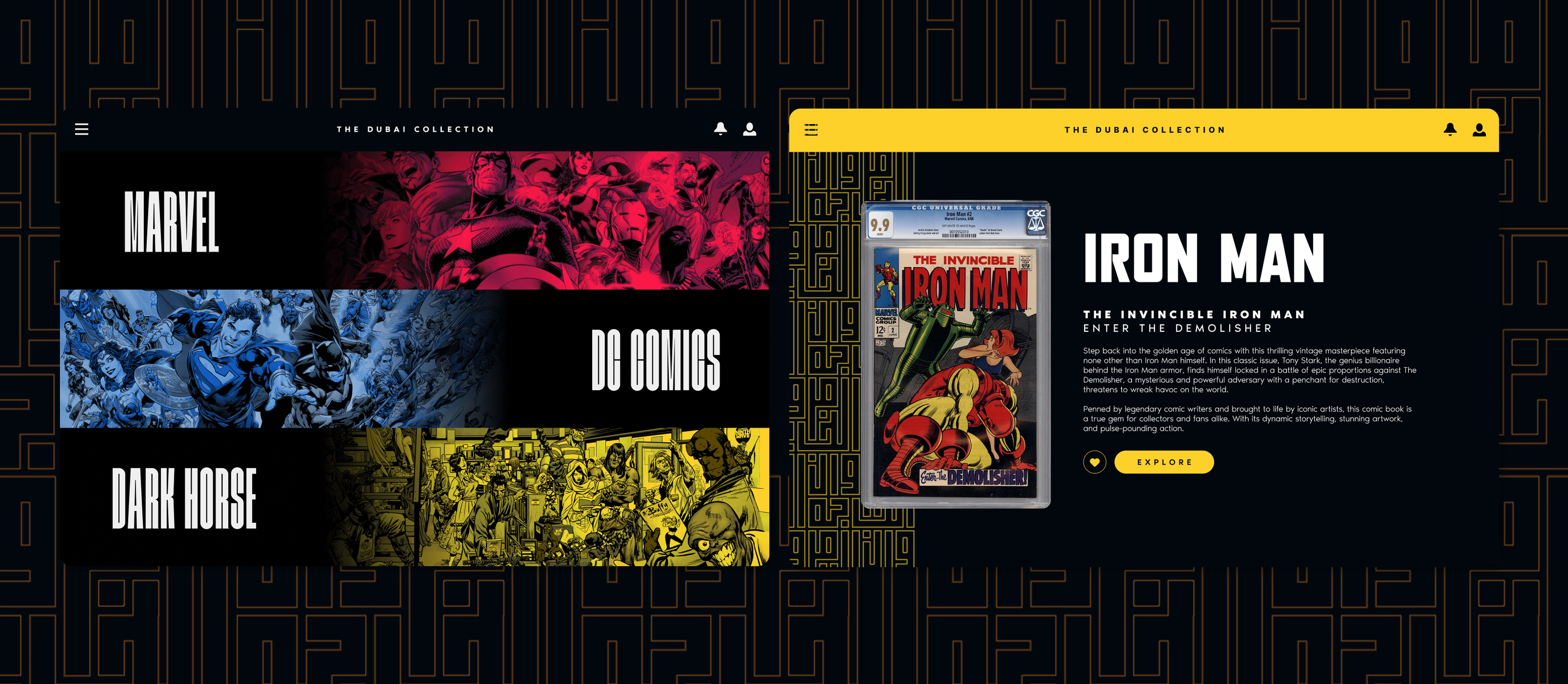
The Dubai Collection was a rapid-pace, mini-branding exercise we did for one of the world's most prolific comic book collectors, known for housing one of the largest, most extensive, vintage collections in existence. The Collector himself, though, started his journey upon being gifted a Batman comic by his mother during childhood; the initial spark fuelled a drive to amass a collection that rivalled none, housed in his home country of the UAE.
Logo
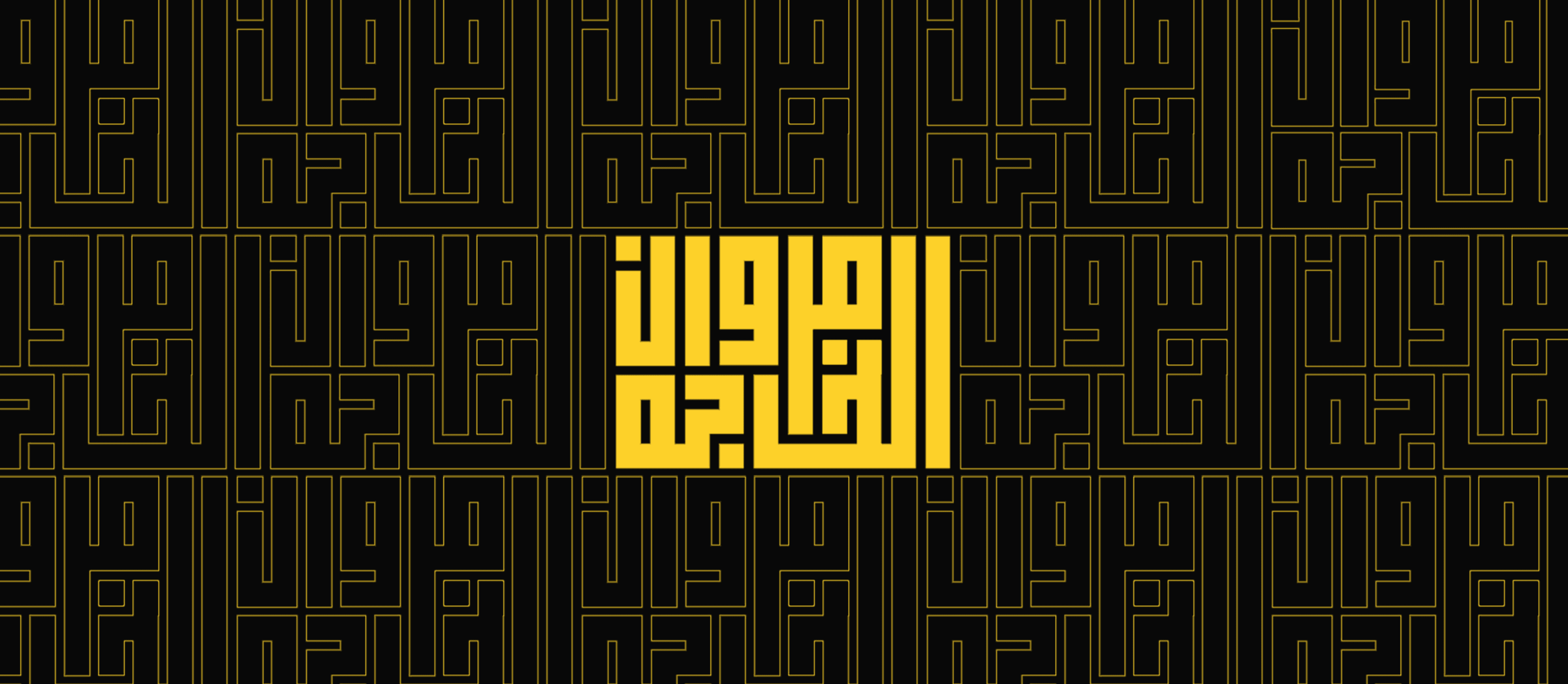
Through a competition framework, multiple design contenders were evaluated to find the best visual representation of The Dubai Collection. Ultimately, the mark that was chosen was done so because it reflected the origins and culture which the Collector himself is from. The logotype was also crafted with a minimalist, clean aesthetic using an extensively kerned typeform. The result was a balance between the seriousness of a world-class collection and the playfulness of its comic book origin story.
Colour
Inspired by the visual history of graphic novel art, the colours we employed pay tribute to the past. The primary palette draws inspiration from iconic titles like Venom, Watchmen, and Atom, with provocative, timeless tones reminiscent of their ink-based origins. The secondary palette takes cues from Blue Beetle, Daredevil, and Batman, giving the set deeper, more emotionally resonant shades that ground the overall visual scheme.
Typography

For striking, bold statements, we picked Mosa and Milleniapolis as display typefaces for their block-style forms that mirror the theatrical panels of comic books. For more extensive reading material, we leaned on Noir Pro for its clean, modern letterforms and superior legibility at smaller point-sizes. This mix gave us designs that were as expressive as they were readable.
Elements
We also designed a pattern inspired by the logomark itself, created as a visual nod to the iconic comic panels where the action unfolds. This pattern can be applied across multiple mediums, giving the brand a visual motif to rely on when words and images take centre stage. On top of that, we created a 3D rendering of the logo. Encased in glass, yet acting as a screen on which to project other visuals; it can be used in everything from marketing materials, to exhibitions, and other creative outlets. From stationary to clothing, all other collaterals were crafted not only as functional designs but also as artistic homages to the graphic novel format; Each piece crafted to express a brand that is as much an art piece as the collection itself.